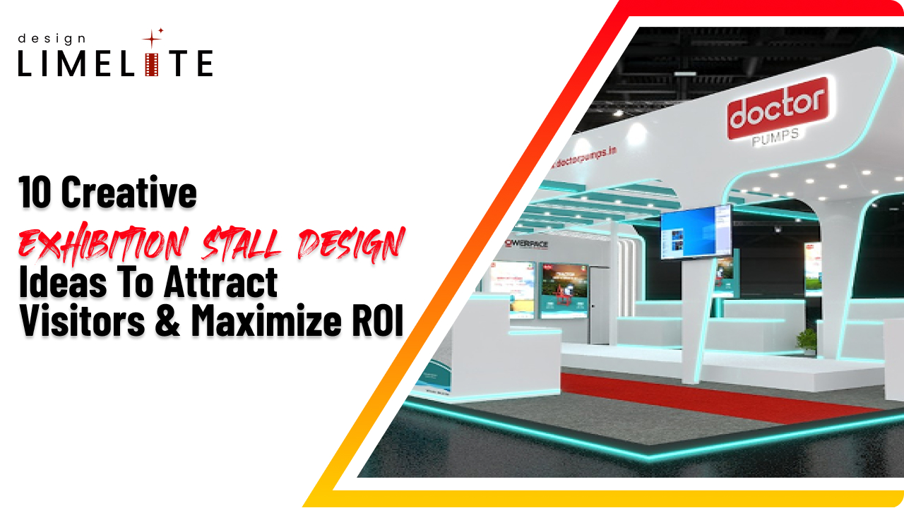
At a trade show, your stall is your first impression. It’s how people notice you. And if it’s done well, it’s how they remember you.
Effective exhibition stall design encourages people to stop, look, and ask questions. It gives your brand a clear voice in a crowded space.
If the layout makes sense and the message is clear, people stay. And when they wait, the chances are high that they will talk or ask questions.
This is where experiential marketing comes in. It’s not just about showing products. It’s about creating a moment people connect with. That’s what leads to real conversations and real conversions.
Strong brand visibility starts with smart design. And smart design starts with knowing what your visitors need.
A recent Exhibitor Online study found that 60% of exhibitors say creative booths bring in more leads and better ROI. That’s a clear reason to rethink how your stall works.
This blog shares 10 stall design ideas that help you get noticed, bring in more visitors, and make your trade show budget work harder.
Each idea focuses on real interaction not flashy setups. If you want people to stay longer, talk more, or remember your brand, these tips are useful.
Why Exhibition Stall Design Matters More Than Ever
Trade shows have changed. A plain banner isn’t enough anymore. People expect something real and worth their time.
They are looking for experiences, not just freebies and awkward brochures. It's just about giving people something to remember- something cool or personal.
A great exhibition stall design isn’t just eye catching. It’s your moment to make ‘oh wow’ reactions. It sets the vibe, helps people actually recall your brand, and gets them to stop scrolling on their phones for a second and actually interact.
If your setup’s confusing, cramped, or, worse, boring, you’ve just lost them before the first “hello.” A solid, interactive booth helps you build trust. All that EEAT+ stuff (Experience, Expertise, Authority, Trust, plus Engagement Get people involved and win their trust.
Decide how you want people to feel when they see your stall. Then design it to match that feeling.
Top 10 Exhibition Stall Design Ideas to Attract Visitors

❶ Immersive Storytelling Zones
Use AR or VR to turn your stall into a real experience. Instead of handing out flyers or pointing to posters, let people explore your brand in action.
Here’s how it works:
- A visitor puts on a headset and walks through a virtual demo.
- Or they scan a product with a tablet and see extra info pop up.
This kind of interactive display helps people understand your offer quickly. It also makes your stall more memorable. People stay longer and are more likely to remember you after the event.
❷ Bold Color Psychology & Lighting
Color changes how people feel. It sets how people feel as soon as they see your stall.
- Red and orange are warm colors. They make your stall feel active and help draw people in naturally.
- Blue and green are cool colors. They create a calm, clean look and help your stall feel more relaxed and focused.
- Use bright colors to highlight important points, and neutral ones to keep the background simple.
Lighting works the same way.
- Use bright lights to get attention to key products.
- Use softer lights where people sit to make the space feel calm.
Color and light help determine how people walk through your stall and what catches their attention.
A simple exhibition stall design can feel inviting if you choose the right colors and lighting. You do not need to spend much—just know how you want people to feel.
❸ 2-sided open exhibition stall design for Flow & Visibility
A 2-sided open exhibition stall design lets people walk in from either side. It feels open and easy. You don’t need signs or instructions visitors find their way in naturally.
This layout works well in busy aisles or corner spots. You can keep the space open and talk to more visitors. If it feels inviting, people are more likely to stop and look around.
It also improves visibility. With two open sides, your branding and key messages are seen from more angles. That means more eyes on your stall, even from a distance.
You don’t need fancy structures. Just keep the layout clear and make sure your main visuals are easy to spot from both sides.
❹ 3-sided open exhibition stall design for Immersive Branding
A 3-sided open exhibition stall design gives you space to guide people through your brand. Visitors can enter from different sides and move naturally through the layout. Each panel can show something useful, your main offer, a product demo, or a short story about what you do.
Each wall can serve a purpose:
- One side for your core offer
- One for visual storytelling or product highlights
- One for interaction demos, touchpoints, or seating
This setup helps you build a clear experience. People don’t just glance, they walk through and take in your message step by step. It’s a good way to show depth without overwhelming them.
You don’t need fancy visuals. Just keep things simple and focused. Make sure each side adds value and leads visitors to the next point.
❺ Simple exhibition stall design That Speaks Volumes
You don’t need a big setup to make an impression. A simple exhibition stall design works when everything is clear and easy to understand.
Minimal layouts help people focus. They cut out distractions and make your message stand out.
Here are a few exhibition stall design ideas that follow a minimalist approach:
- Use clear signage. Keep the message short. Make it easy to read from a distance.
- Leave space to move. Don’t crowd the area. Let people walk in and look around without feeling blocked.
- Highlight one thing. Pick one product or message. Don’t try to show everything at once.
- Stick to neutral colors. Use contrast only where you want people to look.
- Keep lighting simple. Use soft lights to create a calm feel. Add spotlights only where needed.
Minimal design isn’t about doing less. It’s about doing only what matters. A simple exhibition stall design can feel sharp and confident when it’s built with purpose.
❻ Gamified Engagement Zones
Games make people stop. They let visitors take part, not just stand and watch. If done right, gamified zones can turn walk-ins into people who stop and take part.
Here are a few simple ways to add gamified elements to your exhibition stall design:
- Spin-the-wheel: Quick, easy, and familiar. Good for giveaways or small rewards.
- Touchscreen quiz: Ask short questions that connect to your service. Keep it light.
- Mini challenge: Let people try something hands-on. It starts conversations.
- Stamp card or digital check-in: Encourage movement across your stall. Reward completion with something small.
You don’t need flashy tech. Just make it easy to join and clearly tied to your message. If it feels fun and simple, people stay longer
and remember you after they leave.
❼ Live Demos & Micro-Presentations
Integrate live demos into your exhibition stall design strategy. Live demos show how your product works.
They help people understand what you offer without needing long explanations. A short demo can do more than a brochure it shows real use, not just features.
Here’s how to use demos in your exhibition stall design:
- Keep it short. Two to three minutes is enough.
- Focus on one thing. Don’t try to show everything.
- Use real examples. Show how it solves a problem.
- Repeat often. Run demos throughout the day.
- Make space. Add a small zone for people to watch without blocking others.
- Add micro-presentations. Use short talks to explain your offer. No slides, just a clear message.
Live demos make your stall feel active. They give people a reason to stop and remember what you do.
❽ Eco-Friendly Exhibition Stall Design
You don’t have to be some eco-warrior to care a little. It’s about making better choices, not perfect ones. If you reduce waste and make your stall less harmful, that’s a win.
Simple ways to make your exhibition stall design more eco-friendly:
- Reuse frames and panels. Modular setups save money and cut down on waste.
- Use materials like cardboard and reclaimed wood. Biodegradable signs also work well.
- Skip printed handouts. Use QR codes or screens to share info.
- Add plants. They soften the space and show care.
- Cleanup plan. Set up bins for trash and compost. Keep packaging simple.
You don’t need a large setup. Just keep things clear and steady. If your stall reflects your values, people will notice and remember.
❾ Multi-Sensory Experiences
People don’t just remember what they saw they remember how it felt. A stall that uses sound, texture, scent, or movement can have longer attention and leave a stronger impression.
Here are a few simple ways to bring sensory design into your exhibition stall design:
exhibition stall design:
- Play soft background audio or product sounds.
- Add samples, textured surfaces, or hands-on demos.
- Add mild fragrances that fit your brand.
- Use rotating displays or touchscreens.
- Change brightness or warmth to set the mood.
You don’t need to use everything. Just choose one or two that fit your message. When people use more than one sense, they’re more likely to stop, connect, and remember.
❿ Influencer & Social Media Integration
Your stall should work in person and online. Small design changes can help visitors and influencers. Here are simple ways to make your stall easier to share online:
- Photo spots: Set up a clean backdrop or product area that people can easily photograph.
- Visible hashtags: Place your hashtag where people can see and use it.
- Live moments: Include a demo or activity people want to record.
- Tag prompts: Remind visitors to tag your brand when they post.
- Creator space: Set aside a small area for influencers to shoot or go live.
You don’t need flashy tech. Just make it easy to capture and share what matters.
How to Choose the Right Exhibition Stall Design for Your Brand
Here is a simple table that shows a comparison of a 2 sided open exhibition stall design vs. 3 sided open exhibition stall designs. It will help you choose what works best for you.
| Category |
2-Sided Open Exhibition Stall Design |
3-Sided Open Exhibition Stall Design |
| Open Sides |
Front and one side open |
Front and both sides open |
| Visitor Flow |
Controlled entry and exit; moderate visibility |
High visibility and free movement from three directions |
| Brand Exposure |
Good for focused messaging |
Better for broad visibility and walk-in engagement |
| Space Usage |
More wall space for graphics and storage |
Less wall space; more open layout |
| Privacy & Control |
Easier to manage interactions and crowd flow |
Harder to control flow; more exposed |
| Best For |
Product demos, consultations, semi-private setups |
High-traffic zones, casual browsing, open brand displays |
| Setup Complexity |
Easier to plan and furnish |
Requires more planning for layout and signage |
| Visual Impact |
Strong front-facing design |
More dynamic and inviting from multiple angles |
Measuring Success: KPIs for Exhibition Engagement
Track what matters in your exhibition stall design
Good design should lead to useful results. To know if your stall is working, track simple metrics that show how people respond.
Here are clear KPIs to measure performance:
- Footfall: Count how many people visit.
- Dwell time: Note how long they stay.
- Interactions: Track demos, sign-ups, or conversations.
- Social shares: Watch for posts, tags, and mentions.
- Lead quality: Review the contacts or inquiries you collect.
- Repeat visits: See if people come back or bring others.
- Feedback: Ask for short comments or ratings.
Final Thoughts
Good exhibition stall design is not about showing off. It’s about keeping things clear and easy to move around. So stick with what does not confuse visitors and figure out your next stall design change from there.
What to focus on:
- Use materials that break down easily and don’t stay in the environment for centuries.
- Add things like sound or texture to help your stall stand out and be remembered.
- Focus on a social-friendly design to encourage sharing.
- Pick 2 sided or 3 sided open formats based on space and visitor flow.
- Track footfall, dwell time, interactions, and feedback to see what is working.
What to do next:

- Pick a setup that actually fits your room and the crowd you’re dealing with.
- Add one or two sensory (sound or texture) touches that support your message.
- Set up simple prompts for social sharing.
- Track basic visitor data and feedback.
- Review your signage and materials for clarity.
If you need a partner to build your stall, Design Limelite is a design and fabrication studio based in Ahmedabad. We don’t just make stalls look good, we make them work. Our team started with two visual storytellers.
We mix branding, layout, and how people move through a space to build stalls that feel clear and intentional.
We handle everything ourselves from the first sketch to the final setup, so you stay in control throughout.
Whether it’s a small booth or a large setup, we build stalls that show your brand clearly and speak to real people.